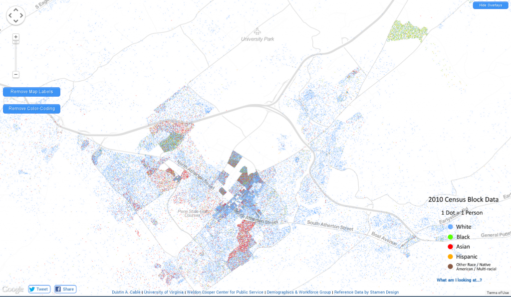
Dustin Cable at the University of Virginia has created a fantastic map: every person enumerated in the 2010 US census, by place, and color-coded by identified race.
Slate uses the map to explore segregation in major US cities, but I of course used it to look at my own town (click for bigger).
Central Pennsylvania is largely white, but on top of that is overlain the effects of a major research university. You can clearly see where the Asian grad students like to live, for example. More depressingly, you can also see State Correctional Institution at Rockview just northeast of town.
The map is fascinating, from the broadest overview of the entire continental US, to the highest zoom on our cities and towns: history, culture and landscape all tied together.
